


Hot Take: Branding Has Never Mattered Less...and More
Elizabeth Goodspeed on nostalgia’s limits, the erosion of trust in good design, and how overproduction killed authenticity.

CHERRY ON TOP 🍒 is our monthly newsletter exploring the ins and outs of everything that modern businesses need to truly shine. We dive into topics that live at the intersection of our two companies – ORCHARD STREET, a seed fund & DALY, a comms+ agency – as both help founders get the best ideas out into the world, through outstanding operations, comms, and culture-building.Alex here! Before I met my graphic designer husband, Hamish, more than 10 years ago, I really didn’t know anything about the design industry. (A great introduction for me early on was watching the documentary Helvetica.) Then, when we started working on projects together, I could see the fingerprints that design left everywhere — and started caring about it, appreciating it. I began using the word “typeface” instead of “font,” and eagerly pitched his work to design press. With one specific project, we landed a bunch of excellent coverage and I said, “You’re famous!” to which he said, “Well, it’s kind of like being a famous plumber.”
Things are different now. All types of brands now care about their branding, and realize the importance of how they show up in the world. Consumers care, too. Sure, everyday people who don’t need to think for a second about logos might assume being a graphic designer means you’re in “advertising,” but there is now more attention than ever around ~brands~ and their aesthetic decisions.
As a letter primarily focused on the intersection of comms, culture, and ops, we of course could not wait to take a deeper look into the value of design — especially since these days, it’s considered table stakes for any company’s success. And with that, I pass the mic over to Elizabeth Goodspeed, a brilliant designer and writer, to break down why all design evolves to look the same over time, and why branding won’t save a subpar product, no matter how good it looks.
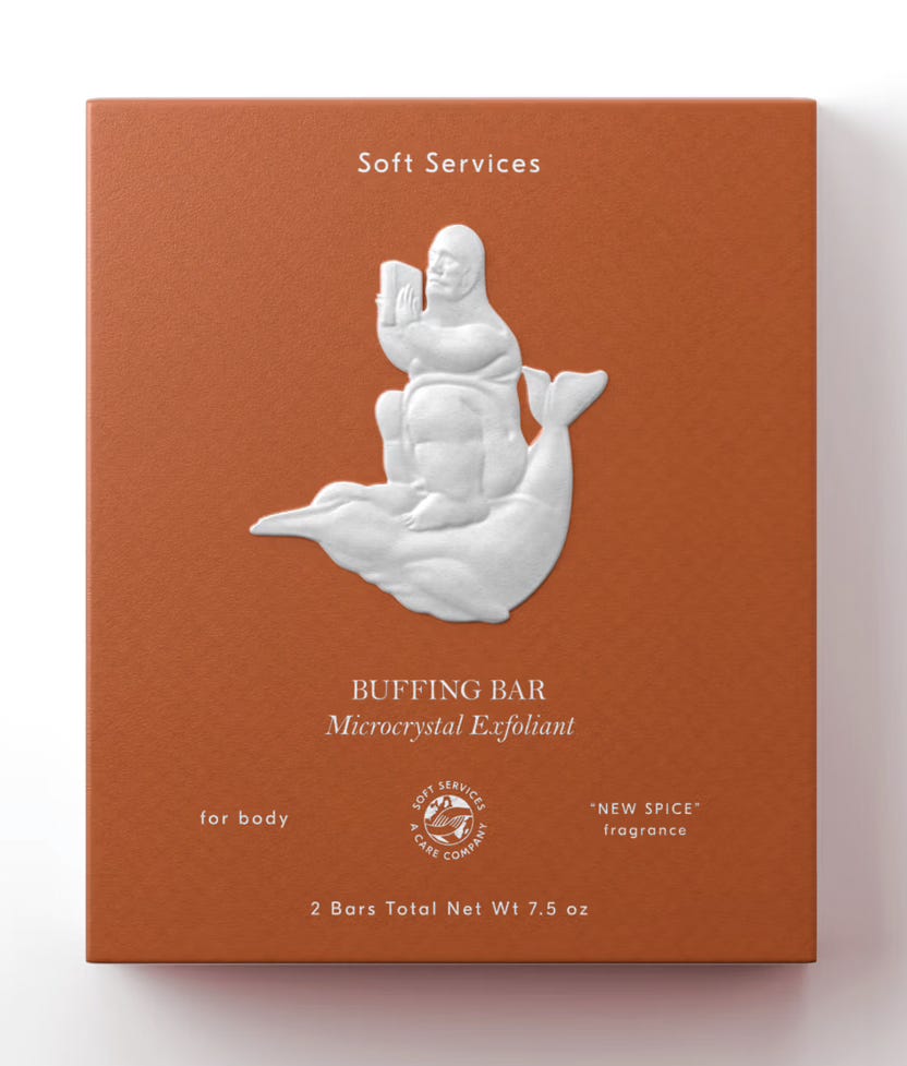
Elizabeth: It’s hard to find a self-proclaimed tastemaker these days who doesn’t have something mean to say about “Millennial Branding.” Just last month, the cult-favorite newsletter Blackbird Spyplane (“Your No. 1 source for ‘unbeatable recon’ into style, travel & culture”) put out a takedown of the so-called “Affluent Millennial”-coded aesthetic, calling it “beyond torched” and lamenting the endless stream of pastel hues and blobby sans-serifs.
We all know the spiel by now: today’s brands are overly polished, focus-grouped to death, and indistinguishable from one another. Brands used to be witty, authentic, or effortlessly cool — and now, everything just feels the same.
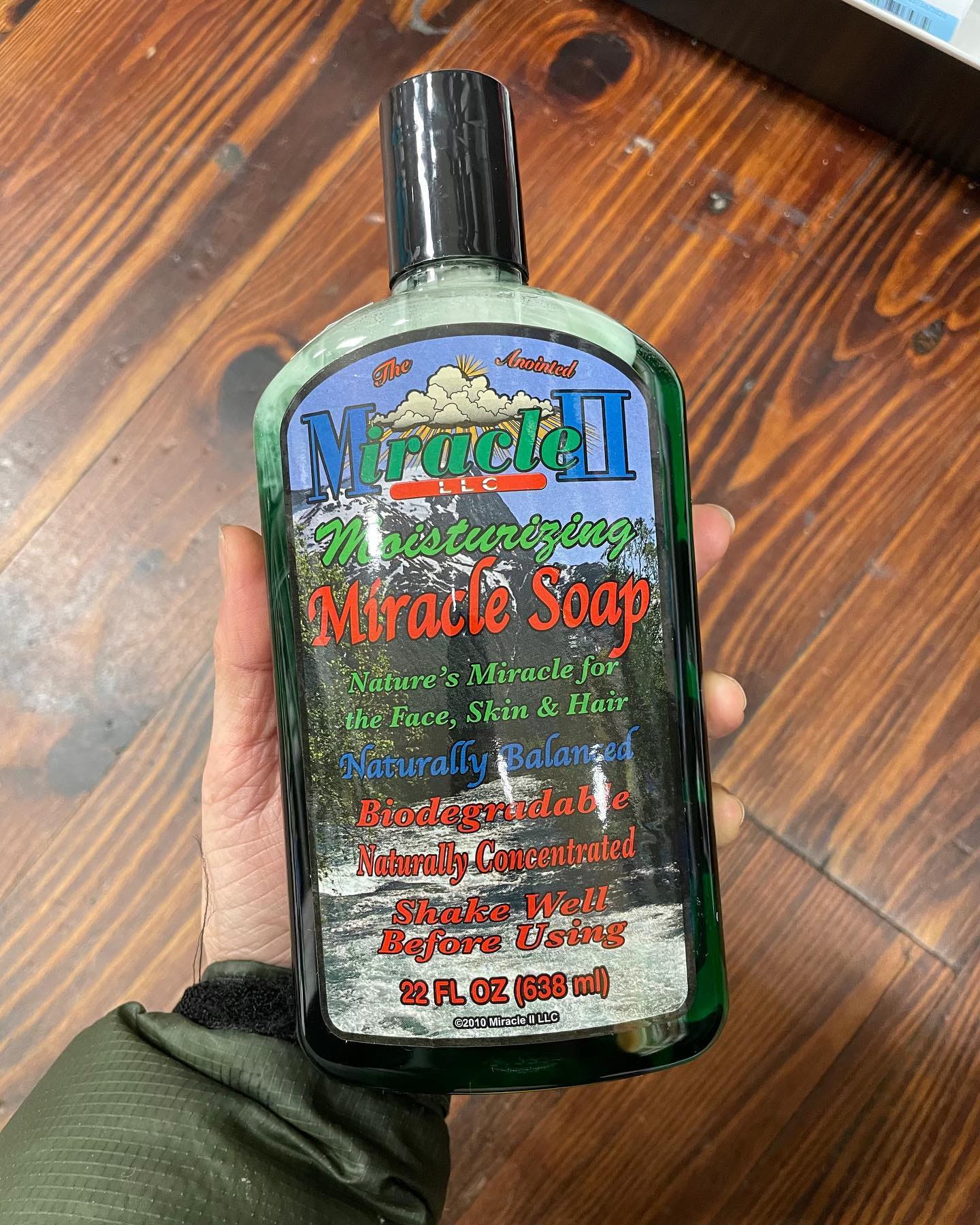
In this desert of blah that defines so many brands today, critics often point to the same handful of visual oases: Dr. Bronner’s, Bob’s Red Mill, Bragg, and other packaging that looks like it was designed in Microsoft Word. More broadly, there’s a tendency, especially from the creative class, to treat old branding as inherently better — whether it’s the crisp modernism of vintage Braun, the maximalism of a neon ’90s candy wrapper, or the blunt simplicity of a no-frills grocery label (case in point: I went viral on X last month for a tweet about a label that said “diet pudding”).
That said, the Brauns and Braggs of the world represent two very different relationships between branding and value.
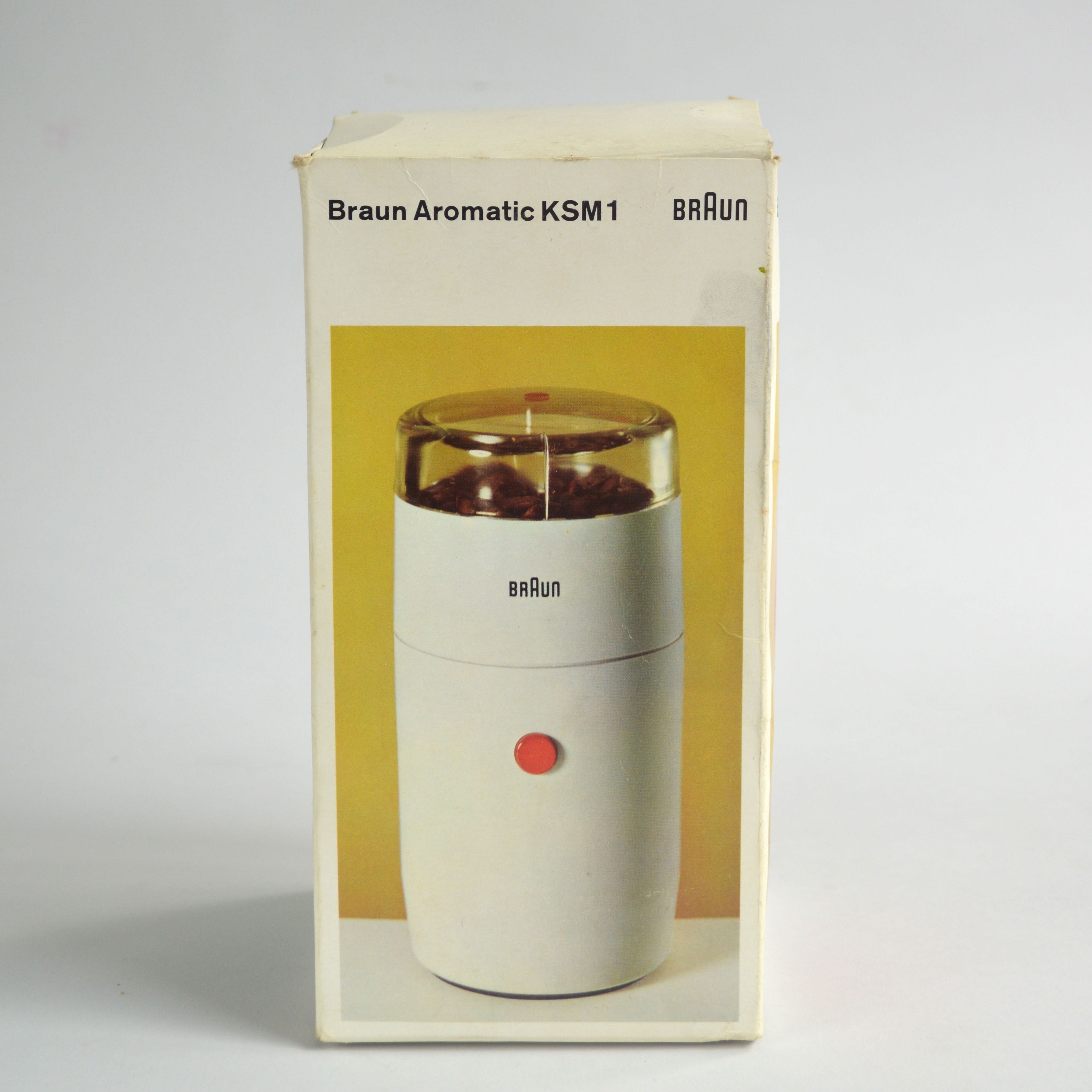
Braun signaled quality through precision. Their branding was an extension of their product ethos, which also had the convenient side effect of being good marketing. The design wasn’t trying to sell you on quality — it was the quality. Good packaging, ergo, good product.
Bragg, by contrast, signals quality through indifference. The layouts are chaotic, the colors clash, and the type hierarchy is a mess. To the contemporary eye, it barely looks designed at all. But that’s exactly what makes it appealing. It suggests a time when the product was the brand — branding was an afterthought because the product spoke for itself. And the fact that Bragg has stuck with this same visual mess for decades only doubles the idea down: if it’s lasted this long, it must be good! Bad branding, ergo, good product.
Both approaches — treating branding as an extension of product quality or disregarding it entirely — are nearly impossible to replicate today. A sleek, rigorously designed identity no longer signals care and craftsmanship; it just signals that someone hired a good agency. And in a landscape where many brands exist as little more than a marketing layer over outsourced products, good branding doesn’t necessarily mean a good product, either. A beautifully-designed brand becomes just another drop in the endless sea of Millennial Brands. Meanwhile, ugly packaging in 2025 doesn’t automatically mean the product is good. Sometimes bad design is just… bad.
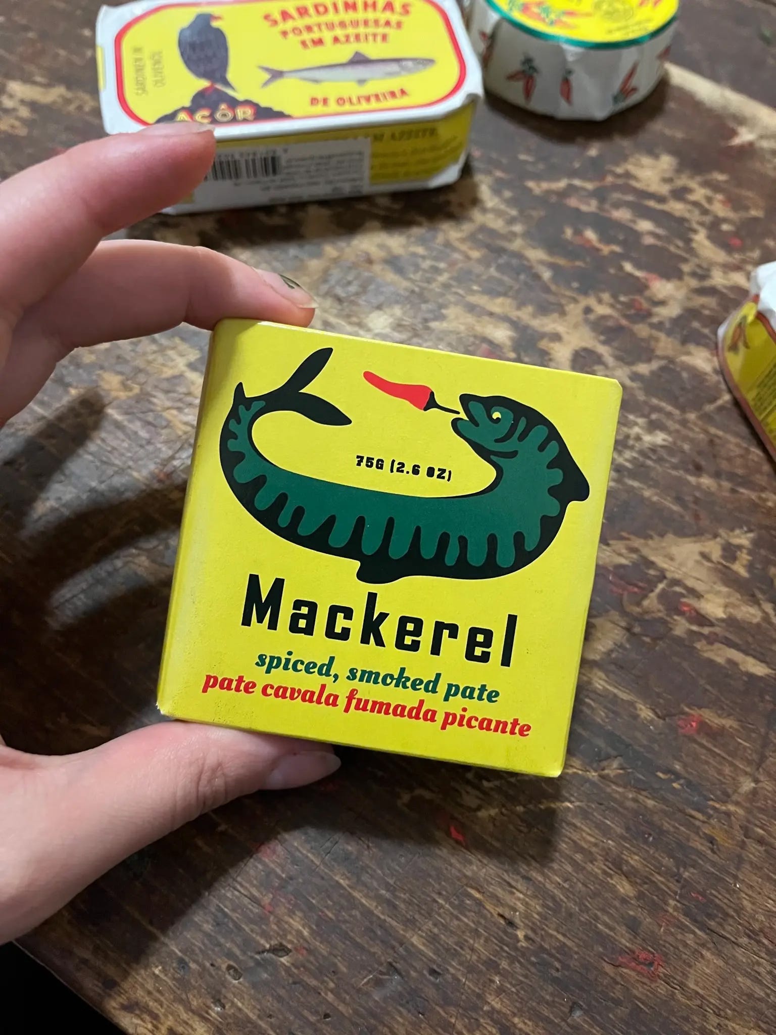
In any case, designers today aren’t pulling ideas from thin air. If anything, they’re pulling from the same past that critics of Millennial Branding hold up as superior. The recent wave of archive-forward rebrands (Burger King, L’Eggs, Edge, etc.) makes it clear that vintage aesthetics are as much a source of active inspiration as they are a point of passive nostalgia. The Modernist legacy of Braun lives on in brands that build their identities around strict grids and Helvetica — The Whitney, Herman Miller — while Bragg’s chaotic, accidental charm has been deliberately recreated in today’s lo-fi, DIY-inspired branding (think of packaging that includes faux fruit stickers or brands like Thai Diner and Gen Z Water referencing old HTML aesthetics). But none of it lands the same way.
People love to complain about branding, but what they’re really reacting to is its inescapability. It’s not that they dislike contemporary design; it’s that they don’t trust it. The more omnipresent branding becomes to our collective hive mind, the harder it is for it to signify anything beyond itself.
So what’s a brand to do? Design still matters, maybe more than ever. Even in a world where branding is table stakes, it still shapes how people perceive what you’re selling. There’s no opting out, so you might as well lean in. Good perfume needs a little funk, a little rot, to make the florals sing; great branding works the same way. Brands that feel too engineered for consumption don’t resonate, but neither do the ones that try too hard to be quirky for quirk’s sake. The best brands lean into a distinct offering, not just a distinct look. Avoid overly sanded down edges as much as sharp ones. Make a choice just because it delights you. In short, follow your nose — it got you this far.
Of course, none of this matters if what you’re selling isn’t worth buying. I love reading the Dr. Bronner’s bottle in the shower as much as the next person, but I don’t buy it for the packaging. I buy it because it’s the only thing that actually got the skunk smell out of my dog last year!
The Cherry on Top: Everything is branded, even if you don't think it is. If the product’s bad, no amount of good design will save it — but if it’s great, even a mess of a label might. Good branding isn’t about being the most polished or the most irreverent; it’s about making a choice that actually means something.
Elizabeth Goodspeed is an independent brand designer, educator, and writer who really, really loves design history.
This is great!